a UX Redesign
My Role:
UX Designer & Researcher
The Team:
Haley Hetrick, Sara Howard, Monisha Shukla
Figma | Google Suite | Miro | Optimal Workshop
As the internet evolves, having a strong online presence and an intuitive UI is becoming increasingly important to remain relevant.
My role as a UX Designer and Researcher was to refresh the UI of the 501(c)(3) organization
I CARE to help it reach more volunteers to acheive its mission of helping low-income seniors get rides to the places they need to go.
Don't have time to read? Watch this project being presented instead!
Jump to 4:33 to see me speak
The Process
The Organization
Operating as a 501c non-profit organization, I CARE offers safe and reliable transportation services to senior citizens and gives interested volunteers the opportunity to make a meaningful difference in their community.
The Problem
However, people interested in helping seniors within their community struggle to understand how to volunteer with I CARE due to a lack of information about responsibilities, requirements, and scheduling. This causes potential volunteers to give up and abandon their research of the site before ever getting started.
The Hypothesis
We believe developing a responsive web design for the non-profit I CARE will help interested volunteers better understand how to sign up for driving shifts and clarify what volunteering entails.
The User
Persons, like our persona Jenn, who are interested in giving back to their community by becoming volunteer drivers for the 501(c)(3) I CARE.
Empathize & Research
We kicked off our project with one of my personal favorite parts of the design process: research.
Survey Results
Before beginning our interviews, the team put together a survey and distributed it via our personal and professional networks. We were able to distill our results to three core findings:
How often do you volunteer?
33% of respondents answered Often (1-2 times/week) or Sometimes (1-2 tiems/month) but 66%answered Rarely (1-2 tiems/year) or Never (no time).
What matters when choosing a volunteer opportunity?
100 % of respondents consider flexible scheduling to be a determining factor in where they volunteer. Ranking second at 77.8%, respondants noted that volunteering with a friend was also an important motivator.
What would interest you about volunteer driving for senior citizens?
Giving back to their community (100%) and building meaningful relationships (88.9%) were the largest motivators according to respondants.
Persona
To best understand our user, we came up with Jenn, our persona, as a woman of the "sandwich generation" who is well accustomed to caring for others and feels a deep sense of responsibility when it comes to caring for the older generation and giving back to her local community.

Affinity Diagram
While our survey was out collecting responses, we each interviewed potential users to uncover meaningful details about their interests, motivators, and pain points when it comes to volunteering and organized them into an affinity diagram.

Competitor Analysis
In order to create an excellent product, we needed to understand what we were up against in the current market. Some heavy hitters already on the market included:
-
Let’s Ride Atlanta, which offers free rides in an electric car to anyone. However, they’re limited to a 3-mile radius within the heart of Midtown and don't provide much clarity around safety and reliability.
-
Senior Citizens, Inc offers food delivery, housekeeping, and wellness checks services. It’s also a recognized partner of Meals on Wheels, so they have a larger network of resources but for elders interested in maintaining independence and mobility this isn’t the most attractive option.
-
MARTA is an affordable way to access locations further away from your immediate neighborhood, however the train stations are few and far between, which requires a level of mobility that perhaps not all seniors have, and bus timetables aren’t always the most accurate.
We found that our service is the best option for seniors interested in maintaining their mobility and independence.

Define
Based on our research findings, we drew up an Empathy Map, further defining our user's motivations:
-
She says she wants to make a lasting impact on her community.
-
She thinks volunteering is a worthwhile activity.
-
She feels connected to others through volunteering and wants to make meaningful relationships.
-
She wants to volunteer locally.

"I wish I could help everybody"
User Scenario
As we designed our User Scenario, we wanted to dig more into the why of Jenn's desire to volunteer, specifically her interest and sense of responsibility to care for those around her.

User Flow
To visualize the paths we wanted to start our redesign with, we went back to our problem statement and really focused on the fact that our user "...struggle[s] to understand how to volunteer with I CARE due to a lack of information about responsibilities, requirements, and scheduling."
Keeping our problem statement in mind, we used Miro to craft our User Flow.

Storyboard
After organizing our user's journey and flow, we wanted kick-started our creativity by putting together a brief storyboard.

Ideate
Now that we were in the correct mindset, it was time to start thinking about the scaffolding of our redesign.
Card Sorting
With our user flow identified, we pulled the navigation naming convention from the current site and created a card sort using Optimal Workshop. Once we had a robust number of respondents, we leveraged the analysis capabilities within the tool, particularly the Dendrogram report, which provides a great visualization of how our respondents make sense of our site’s navigation.

Site Map
Good products and initiatives are fed by good data, so our site map was directly informed from our card sort results.

Sketches
As we moved into the next phase of our redesign, I drew up some quick sketches for both desktop and mobile options.
Desktop


Mobile


Prototyping
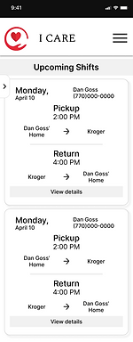
Once we came to a consensus about what we were designing, we assigned creative leads to the different pages. As the lead in charge of the volunteer login and scheduling portal I wanted to design a UI that allowed the user to understand large amounts of information at a glance.


Testing
Six users were interviewed with our functional prototype, both on mobile and desktop layouts. Through this first round of testing, our users revealed some opportunities which allowed us to then iterate and improve upon the original design. Some of the changes I made to my assigned pages were:
-
Added a simple landing page after login, based on user feedback that they didn't like being taken directly to scheduling view.
-
Simplified the scheduling card and changed arrows and arrive/departure verbiage based on user feedback.
-
Mobile scheduling view is now one-directional to take advantage of the vertical space, with pickup/drop off times highlighted for clarity.


Conclusion & Next Steps
Though the project ended after only 2.5 weeks, if given the opportunity to take this product even further I would:
-
Conduct further usability testing and iteration on the pages that have been built
-
Use the feedback we've received to build out integrations like an "add to calendar" option for the scheduler
-
Design and implement a messaging portal for riders and drivers to communicate.